

Effects of colours on your home
Different colours can have various effects on people, as some colours excite while others relax. Some tints can make you feel warm, whereas some can have the opposite effect and make you feel much cooler. Some colours even have the power to make you hungry or take away your appetite and, because of this, it is important for colours in your home to match the tone, feel and style of a room in your home. Here’s a quick guide to how different coloured linens can have different effects on your home:
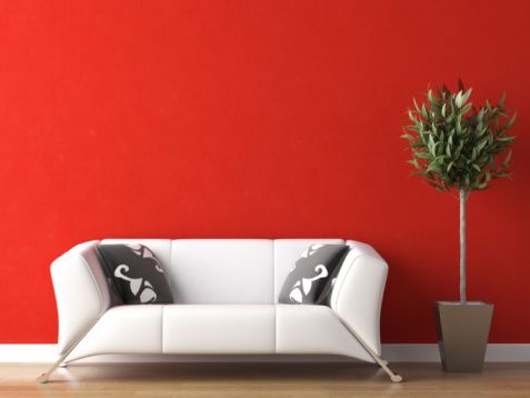
Red
Red is thought of as a warm colour that connotes strength, it is known to raise energy levels and increase blood pressure. Red makes rooms exciting, so would be great for an entrance hallway or a living room where you entertain guests. Beware though that red may prove to be a little too stimulating for a bedroom.
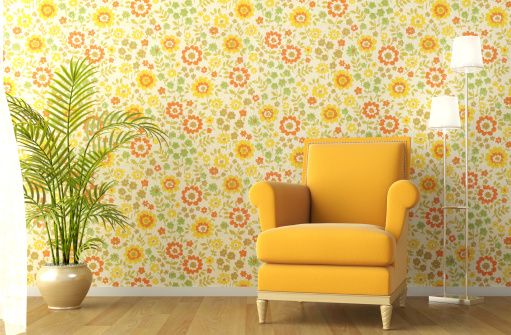
Yellow & Orange
Yellow and orange are both bright, energetic colours that make a room seem friendly; they also give a room a creative atmosphere. They are seen as good for bathrooms, kitchens and workout rooms for their uplifting feelings. Yellow and orange are also known to stimulate people’s appetites making them perfect for kitchens and dining rooms.
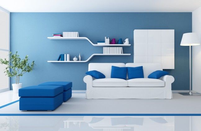
Blue
Blue is a very calming colour, it relaxes you and lowers your heart rate. Blue is very good for comfortable rooms such as living rooms and bedrooms and can be used on things such as blinds and door curtains. Though be careful, as too much blue can make a room appear cold, also dark blues can evoke feelings of sadness so stick to light blues for a refreshing and airy feel.
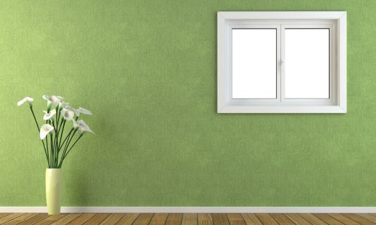
Green
Green is a restful and relaxing colour. Since it’s in the middle of the electromagnetic spectrum, it focuses straight onto the retina, which makes it less of a strain on the eyes. Green would work nicely in the bedroom, even on small things such as cushions and bedspread’s, as it’s a good colour for relieving stress. Keep in mind though, it’s not good when associated with food as it is an unappetising colour, so keep it out of the kitchen!
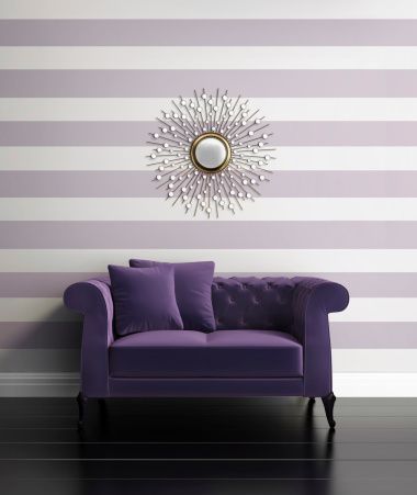
Purple
Purple is a very luxurious and sophisticated colour, especially the darker shades. Purple is heavily associated with royalty and wealth, so can give a room a rich and dramatic feel.
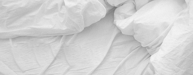
Neutrals
Neutrals such as grey, brown and white don’t evoke any strong feelings, so are used to balance out strong colours to calm a room and to make sure it is not overpowered by a single colour.
Add a comment