

Contrasting Colours in the Home
Using contrasting colours is a bold and exciting way to decorate your home. By combining two or more distinct, opposite hues, you can create vibrant interiors that stand out from the crowd. Contrasting colour combinations offers endless possibilities when it comes to interior design; they can be used to make a statement in any room of the house, from living rooms and kitchens, to bedrooms and bathrooms.
Whether you prefer bold patterns or subtle shades, contrasting colours will help you get creative with your decorating ideas. In this blog post we’ll explore how contrasting colours can be used in interior decorating for maximum impact!
The different ways to use contrasting colours in your home
When it comes to combining contrasting colours in your home, there are a few different approaches you can take. The first is to use a colour wheel as a guide to help you choose two or more hues that stand out from each other. A great place to start is by choosing two colours that are opposite each other on the colour wheel, such as red and green, or blue and orange. For example, painting one wall of a room dark blue and another wall light yellow will create an interesting contrast between the two walls.
Another approach when using contrasting colours in interior design is to select one colour as the dominant hue, while using the second colour only sparingly as an accent. This will give your home a more unified look, while still allowing you to make bold statements with contrasting shades. You can then add accents of darker yellow around the room for extra visual interest.
Finally, layering contrasting colours can be an effective way of creating an impactful design scheme in any room. Layering involves applying different shades of the same hue for varying levels of intensity and depth; for instance, painting one wall navy blue and gradually adding lighter blues towards the ceiling creates a visually appealing effect that draws attention upwards towards the higher parts of the room. This technique is also ideal for creating visual continuity between rooms, especially when they’re separated by doorways or open spaces like hallways or landings.
Contrasting colours offer plenty of options when it comes to decorating your home interiors; from bold statements made with complementary pairs to subtle layers created with analogous hues, they can be used in creative ways to truly enhance any space!
Contrasting colours in different rooms
Contrasting colour combinations can have a big impact in any room. In a living room, for example, two contrasting colours such as blue and orange can create an eye-catching effect. You could paint one wall blue while painting the other orange, or use furniture pieces such as sofas and chairs in either colour. Contrasting colours can also be used to separate different areas of the living room using rugs or wall art.
In a kitchen, you could use contrasting colours in cabinets or appliances. For instance, if you have white cabinetry, you could use black appliances for a dramatic contrast. If you want something more subtle, consider using two different shades of the same colour on your upper and lower cabinets or walls.
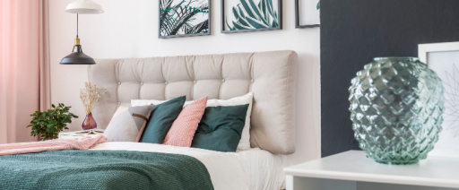
The bedroom is another great place to experiment with contrasting colours. Use one bold hue throughout the space for maximum impact or combine multiple hues for a sophisticated look. Warm tones like reds and oranges are perfect for creating cosy vibes while cooler tones like blues and greens can help make the space feel more open and airy. You can also add contrast through accent pieces such as throw pillows, blankets and curtains.
In bathrooms, contrasting colours can be used to create visual interest with tile patterns or on walls with vivid accents of paint or wallpaper. Consider combining warm shades like reds and yellows with cool blues to create a modern look that will stand out from other bathrooms in your home. You could also opt for lighter shades of grey combined with crisp whites to complete your bathroom design while adding contrast without being too overwhelming.
Choosing the right hues
When it comes to choosing the right combination of hues for maximum impact, there are a few key tips to keep in mind. First, consider the size and shape of your room when selecting colours. For example, darker colours tend to make spaces look smaller, while lighter colours can open up a smaller space. Additionally, it’s important to choose colours that compliment one another in order to create an aesthetically pleasing look. Monochromatic colour schemes are great for creating a calm and peaceful atmosphere, while complementary colours or analogous colours can be used to create more vibrant and dynamic looks.
Another tip is to think about the lighting in your space before deciding on which hues you want to use. Natural light will affect the way a hue looks throughout different times of day or night, so it’s important to consider this when making your decision. Warmer tones work well with natural light and cooler tones may be used if you have artificial lighting such as lamps or spotlights in your room.
Don’t forget about texture when using contrasting colours – different fabrics, materials and finishes can add depth and interest to your colour palette. By considering how textures interact with various hues you can create interesting visual dynamics that make a real statement in any room.
How to use accessories and furniture
Using accessories and furniture pieces can be an effective way to enhance the look of a room with contrast. One way to do this is to choose pieces in both contrasting colours, playing off the strong lines and shapes each colour creates against its opposite. For example, pair a bright yellow sofa with jet black armchairs, or combine a deep blue rug with a pale pink sofa.
Other ways to create contrast include combining different textures in complementary colours. Using velvet cushions on leather armchairs, or wool throws on a rattan rug can create a visual interest and add layers of texture to your space. Artwork can also be used to draw attention to other elements in the room; for instance, hang an abstract painting featuring pops of vibrant colour over an antique wooden dresser for a modern boho look that’s sure to grab attention.
Carefully selecting decorative accents such as vases, lamps, and pillows that feature both colours can help tie together the entire design scheme. Choose pieces that feature both hues in larger proportions or work with pieces that have small pops of one colour throughout for added depth and dimension. The key is finding balance between the two while still creating impactful contrast!
Contrasting colours are a great way to bring vibrancy and energy into your home decor. By combining two or more hues that are distinct and opposite, you can create eye-catching interiors that stand out in any room of the house. Whether you prefer bright patterns or subtle shades, contrasting colour combinations offer an infinite range of possibilities for interior design. When working with contrast in interior design, it is important to carefully select the right combination of hues for maximum impact.
Additionally, accessories and furniture pieces should be chosen to enhance the look of any space with contrast. Furthermore, other elements such as lighting, wall art and textiles can help create a cohesive design when using contrasting colours. With some thoughtful planning and creative ideas, you can make use of colour contrast to add boldness and vibrancy in all areas of your home!
Shop now
If you are looking for some inspiration for your home, look no further! Linens Limited has a wide range of affordable and high-quality products to make your house a home. Shop now!
Add a comment